ASC Logos
design//December 02, 2021
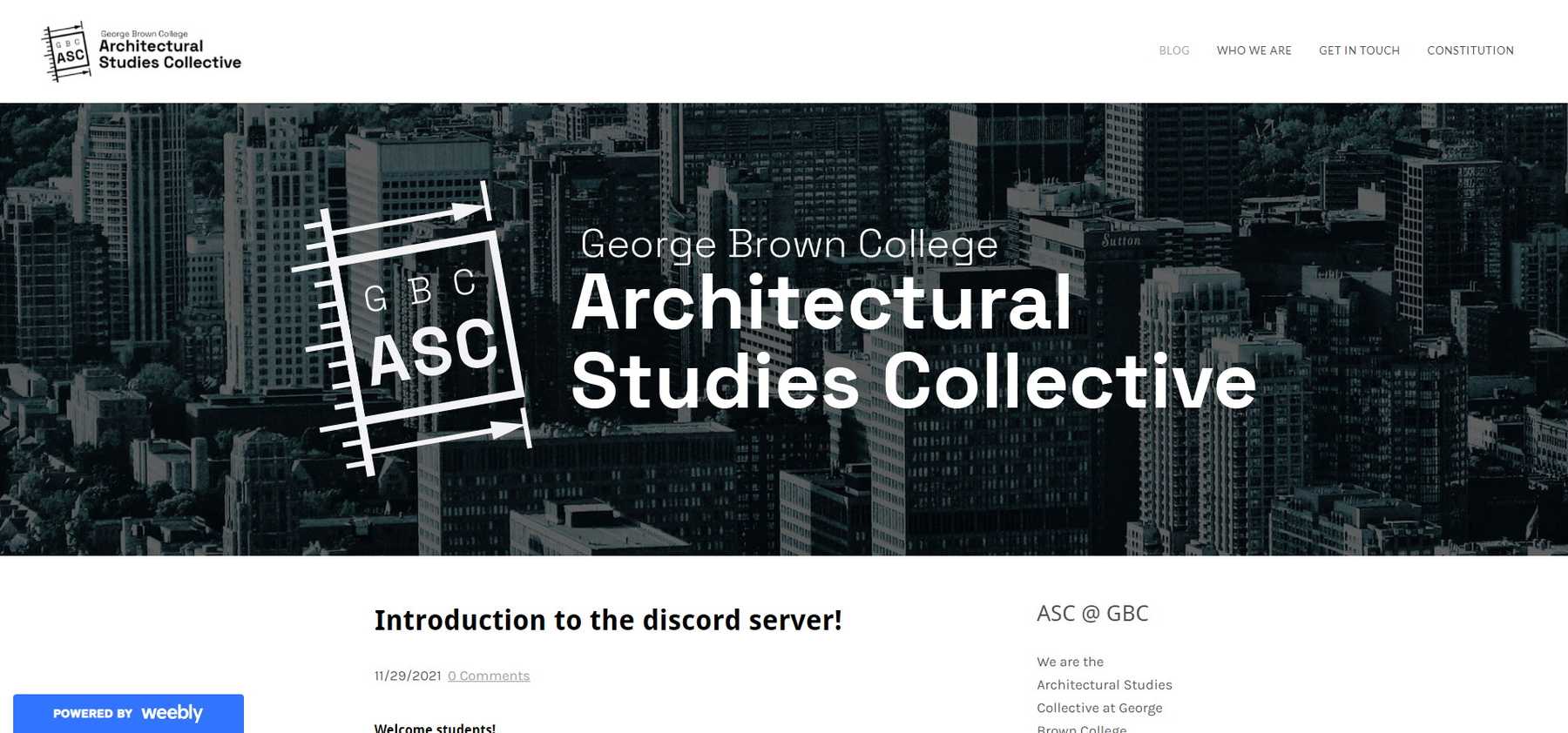
After enrolling in the Architectural Technology program at George Brown College, I had an opportunity to help start a student network. My first job: start the club webpage and design its logo:
To learn more, check out the GBC Architectural Studies Collective homepage at gbc-asc.weebly.com
Process
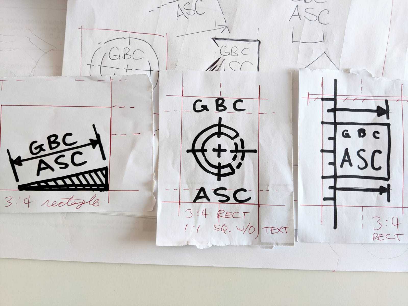
I had been doing a lot of CAD homework and reading blueprints, so architectural graphics were fresh in my head. The first round of sketches produced these three candidates:
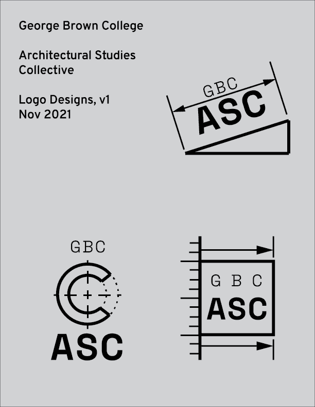
- The triangle + dimensions imply a ramp or roof. I felt that tilting the logo provides an “upwards” motion to the dimension arrows. (the club acronym “ASC” could also imply “ascent”)
- The stylized “C” is decorated with centre lines, another common feature of architectural/engineering graphics
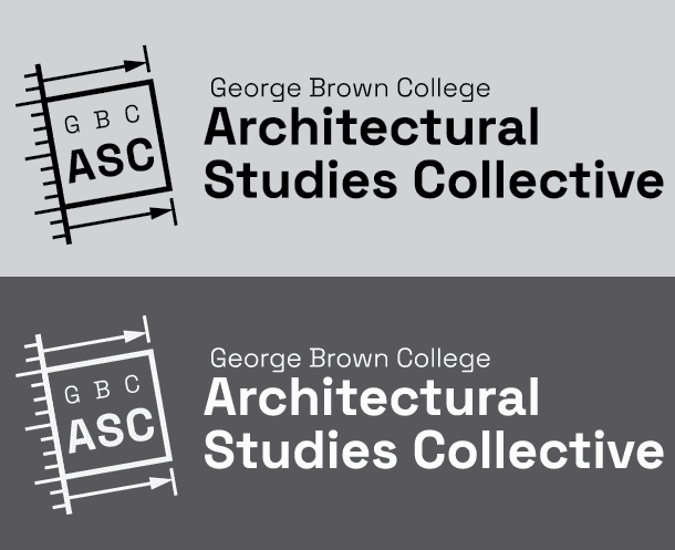
- The third logo incorporates a scale and dimension lines, plus a square. The design is meant to evoke the view of a draftsperson measuring something on a sheet.
These sketches were then refined on Illustrator:
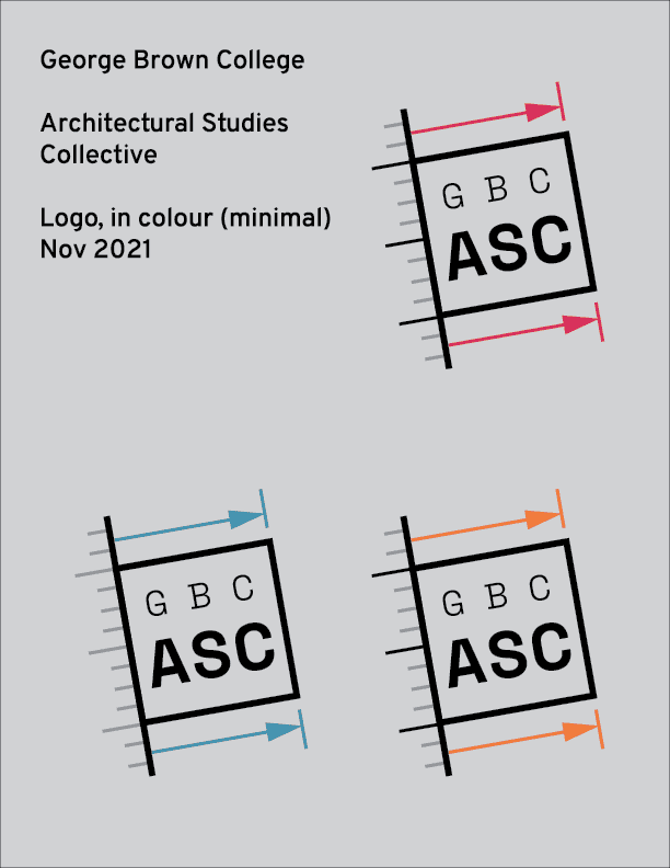
Then I asked my fellow club execs to vote for the logo we wanted, and logo #3 won the groupchat design competition. I then got to work with playing with the colour scheme, and finding a typeface for the club’s wordmark.
And with everything in combination:
