Methodology
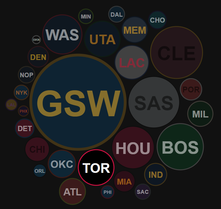
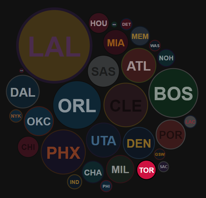
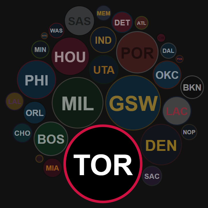
The season summary graphic is designed to show every NBA team's strength compared to all others for a given season. Each team is represented by a circle, with the champion team being the largest one.
Strength in this case, is roughly defined as:
regular season win rate + playoff wins, compared to the season's champions
For the exact calculation in the code:
// pWins is a ratio of playoff wins to max. possible playoff wins
// wRate is the regular season win-rate (as a value between 0 and 1)
// overallRtg is expected to be a float between 0 and 1, and is used like a percent value

let overallRtg = (wRate + wRate + pWins) / 3;

// the championship team receives a 20% overallRtg boost, to
// highlight them on the graphic

if(rec.champion) {
  overallRtg += 0.2;
}
This kind of comparison easily shows the competitive balance between teams in a given season. At a glance, we can see how the 1995-1996 Chicago Bulls and the 2016-2017 Golden State Warriors simply dominated the league's landscape.
1995-1996 NBA season

2016-2017 NBA season

This can be contrasted with the 2009-2010 or 2018-2019 seasons, where the Lakers and Raptors (respectively) won their championship without that level of dominance, or were just competing in a relatively balanced league.
2009-2010 NBA season

2018-2019 NBA season
